Now that I made a bunch gear logic changes and hopefully settled on how gear provides gameplay values, I need to show feedback to the player.
First of all, the player can now have no armor or shields, but my UI is expecting these and appears broken when the values are 0:

The reason is because I removed the bonuses and thus the “enable armor/shields” ones that would tell UI that there is indeed a value to use. So I now just check the max value.
So I can add the actual armor value as determined by equipped gear first:
And the actual shield value:

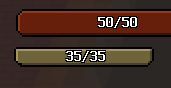
In practice, there would usually be armor in between (and the player cannot drop gear):

I added a bunch of gear properties, but haven’t actually wired these values to be shown in the player info panel (only weapons had values), so I’m doing that, starting with armor that now shows both the armor amount and the protection provided:

Same with shields:

And same with boosters:

What does 48 and 32 mean? Who knows! Okay, okay, duration is 4.8 second and speed is approximately 3.2 tiles per second. But I don’t know if I want a decimal separator there and lengthy explanation of what they mean. It’ll do for now.
I also added the tier-based values, but none of these item differences mean anything to the player unless I can show them. Or rather, unless I can convince the player that they exist. So I need to show them in UI. I think the best way is to actually use the rarity colors and color the label. So, first I need to add all my tiered values for the rarity display option entries:

And then I can easily look up the color and color the labels:

I think this feels much better to the player. Even when gameplay difference is marginal between items, they do get told that there is a difference and color-coded to show a quick preview.
Of course I can’t have the play open their info panel to compare items. I need this to happen in the game world with a quick comparison popup when the player is ready to pick up an item to replace what they are carrying. In fact, this is way more important than the big panel, so I don’t know why I’m not doing it first.
Anyway, here’s a placeholder comparison box that appears when the player is near a pickable weapon of gear item:

I can add a bunch of labels for the same sort of stats as the “big panel”:

And specify custom colors for quick overview of increase/decrease/equal amounts when comparing:

And I can add the actual compared value difference next to it, so there’s an absolute indicator of the change:

I don’t really care if this has a nicer layout — it’s short and sweet and I don’t think I will bother with changing it unless there’s negative feedback.
Anyway, now I need to reposition the panel next to my item (with an offset). Thankfully, I already have the code for damage number positioning, so it’s pretty easy to use that here:

Now I can go ahead and implement the comparison for all other items — booster, shield and weapon (ignore the wrong row for comparison values):


I wonder if I should have a visual difference between item types. There’s the name/label and the item shape itself already, so it might be enough.
One note is that the box compares to the currently equipped weapon and not both of them. I think this is fine, as the player can swap the weapons very quickly and the box will switch to the other.
Finally, I want a smooth transition for the box:

And that about wraps up the major parts of gear values and their feedback. I think I have enough visual and gameplay feedback to justify the feature. In other words, I show it enough in-game so it feels like a full feature and not some back-end stuff I spent ages on and no one ever saw. It should feel nice to get an upgrade, even when it’s tiny.